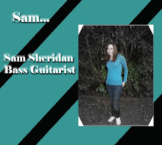
I decided to edit the photos by having the majority of the photo grey and the middle part of the photo in colour as I thought it would make a nice effect and also I think it gives it quite an edgy look and almost looks like an old photograph that has had most of the colour drained out of it. This is also why I chose to use the effect of old photograph book corners on my photos as again I thought it gave them quite a unique look that fits in well with the ideology of my band, their image and their sound.
Wednesday, 10 February 2010
Digipack - Band Info...
I've pretty much nearly finished the digipack for my band The Disadvantaged. All thats left for me to do now is to make the front cover, add that onto my template and then it will finally be finished. So far I've done all of the band members sections of the digipack, and in all of these have used the same font of text, same effects on the text, edited the images of the band members in a particular way and creating a background, all of which I think fits in quite well with the indie image of the band and the sound of their music.
Subscribe to:
Post Comments (Atom)


No comments:
Post a Comment